A new year and a new look for the Fruit Blog
Well, I know I've been a bit scarce lately...between the holidays and everything else my mind's just been elsewhere. But I made a sort of New Year's resolution to keep this thing going, so I sat down to write a new post...
...and instead I re-did the blog template. Hopefully everyone likes it. I don't really know HTML that well, and there are still lingering issues (expect tinkering here and there for a while). There wasn't really a grand vision or anything--I just started screwing around with things.
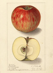
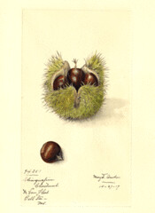
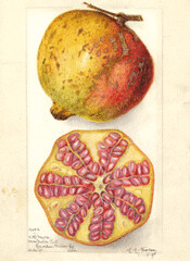
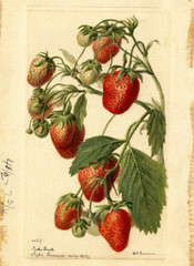
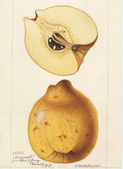
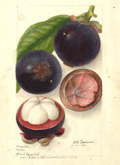
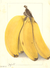
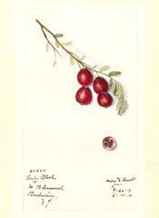
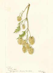
The first thing you'll probably notice is the second sidebar. I decided to do this because to put everything in the one sidebar meant that useful things frequently got buried way, way down at the bottom. I may have somewhat reduced the impact of this by interspersing the fruit watercolors (from the USDA collection), but I thought they looked cool, and they kind fixed my problem with the grey not going down to the very bottom of the page like I wanted. I know things are a little more cluttered now...but hopefully not unreadably so.
Probably the biggest addition is the "Books" section in the sidebar. These are books about fruit and breeding that I've found interesting over the years (I don't actually own all of them, but I do most, and I've at least looked at all of them). The titles link to their respective Amazon pages (although some are out of print, and so your only hope is going to be a used copy). In the interest of full disclosure: I am a part of the Amazon Associates program, and get a cut (a very small cut) of anything you buy through these links. I have mixed feelings about this, since I didn't create this blog with the intention of making money (and what a fool I'd have been if I had!). But I do have a few costs here and there (domain name registration, for example) and a couple of bucks would provide me a little more incentive to keep things going around here when things get slow. I've been approached several times about placing ads on the site, but I've always turned them down. This way I keep control of what gets advertised, and hopefully people find some interesting or useful books. (It's kind of a pain to set up the links, so I have to admit I didn't put a ton of care into their organization or selection. I'll keep adding and arranging this section over time. If you have any suggestions you'd like added, let me know).
Anyway, hope everyone had a happy holidays, and hopefully you'll be seeing a little more of me. Please let me know if the new layout has screwed something up for you, or if you hate it or would like to see other enhancements.
Update: I've checked the new template in Safari, two versions of Firefox, and Flock. I'll check it in Chrome and Explorer when I get to work on Monday, but frankly I don't hold out a lot of hope for Explorer...the site's always looked kind of crappy on it, and I doubt this made it any better.
Labels: Meta Fruit Blog





6 Comments:
It looks good.
2 things:
1) I'm not sure if the pictures along the side really help that much. You split the sidebar into two sides to make it fit, but then you fluff the length with a ton of pictures. Don't get me wrong. I love those old fruit images, but you've defeated what you wanted to do with the layout with the pictures.
2) Ever consider widening the main column? My screen is 1920x1200 and it's just a sliver down the middle. I realize that most people are probably cruising at 1024 x 768 and I bet it looks fine for them... I guess what I'm saying is... You're wasting my pixels. :P
1) Yeah, well the split sidebar thing didn't quite pan out how I'd like. The problem is that I don't have a good way of limiting the length of the middle column (there may be some fancy HTML-ish way of doing it, but Blogger doesn't give me many options). I can either cut it off by date or number of posts (I've set it to 10 posts). The problem is, that on certain browsers, like the bane of my HTML existence, Explorer, the default settings make the text much larger and that middle column runs on and on and on past the bottom of the sidebars. So I made somewhat longer sidebars, because they were already on the short side.
2) I did consider widening the middle column further (it is wider than it was, though not by an incredible amount). There are three main reasons I didn't widen it further: A) The first widening, when all was said and done, screwed up all kinds of things and I was just happy to get them fixed, B) I like to be able to keep it open and visible in one window and be looking up stuff in other windows simultaneously, and C) I like reading my own blog on my phone.
qzz0609
audemars piguet watches
longchamp handbags
ray ban sunglasses
pandora jewelry
coach outlet
nike roshe one
oakley sunglasses
coach outlet
undefeated clothing
michael kors outlet
www0702
michael kors outlet
ugg boots
polo ralph lauren
coach outlet
chloe sunglassess
san francisco 49ers jerseys
coach outlet
cheap jordans
jimmy choo sunglasses
true religion jeans
qzz0723
ray ban sunglasses
fitflops outlet
coach factory outlet
longchamp bags
christian louboutin shoes
canada goose outlet
michael kors outlet online
bottega veneta outlet
polo ralph lauren
houston texans jerseys
lebron james shoes
lebron james shoes
supreme clothing
moncler coat
kd shoes
golden goose sale
supreme outlet
hermes online
stone island sale
yeezy
Post a Comment
<< Home